14) MY FILM CHARACTERS

MY FILM CHARACTERS

Below are detailed descriptions of the characters I had created for my product...


Tom Spencer
An A grade college student on works experience. Seeking a writing job. Has had a good life. Very Intelligent but lazy. Hoody, shirt, jeans, plimsolls. Longish hair. Student Like.


Rick Neville

A professional writer wondering if the student is good enough to become a writer. Has had a deprived life. Selfish, moody, impatient, lonely. Long leather jacket, smart beige dress shirt, jeans, smart shoes. Short hair, no particular style.


KILLER

Insane serial killer, very tall, large build, strong. Mysterious. Ruthless. Violent. Dressed in all black; balaclava, black combats, black boots, black zipped up coat. Uses a knife.


Vince Harvey (Hotel Manager)

The hotel manager, keen to impress Rick. Under the impression he is going to write a review for hotel. Annoying, too friendly. Glasses, smart shirt, bow-tie, jeans, smart shoes.

9) POSTER PLANS

FLAT PLANS AND RATIONALES

POSTER

Below are my very initial plans for my Movie Poster. First is the flat plan...

This was the starting point for the layout and whole design for my poster. Everything I was intending to do is on the plan.

As you can see originally my film was going to be titled 'Dark Room' and was going to represented with eyes (because of the glaring creepiness it creates) and doors (the spooky creaking sounds they create and the mystery of what is behind the door, hence the name 'Dark Room').

Below is the rationale that goes with my poster detailing all about it and explaining everything.


But then my ideas started to change...

As My ideas started to develop and I were to think of alternatives, I realised I liked my new ZERO HOUR idea better. This means i had to change my poster flat plan.

The name had changed to ZERO HOUR, the main image had changed to the killer looking confident in the centre, I knew now that at the top of my poster would be the slogan 'Bad things happen at midnight', the background would be spooky trees with light getting let through that would fall onto the killer to give that creepy feel, and I knew that above my title I wanted 'From the producers of Dark Room' or something along those lines. The poster will fall together properly when I am actually creating it.

The rationale would be basically the same for this flat plan because it entails the same meanings. All different meanings are described in other posts.

12) RECCE & PLANS FOR MOVING IMAGE AND PHOTOS


The ‘RECCE’


Provide answers in paragraph form to the questions below that are relevant to your production


My main photo shoot will take place at the ‘Jamaica Inn’ in Cornwall. The main haunted setting of my film. Filming for my film trailer will also be shot here. The hotel is genuinely titled ‘Haunted’ providing a perfect location for a Thriller/Horror feature.


1.    Will the time of day/weather affect the outcome of the photos? Have you allowed for this?
The time of day and weather will affect my photos. We do not want any kind of weather in the photographs so it is going to have to be a clear day. In the event of this happening the photos that were supposed to be taken outside will be moved inside in artificial lighting and graphically edited so they looked in natural lighting. Some of the photos will be taken at night when it is just starting to get dark, and some will be taken in daylight. The better the variety of photos, the better the chance of getting a good main image for my poster and website homepage. The ideal time of day would be night. This is because the film is of the thriller and horror genre meaning darkness and low light would fit the genre. Images can always be edited as well to create the correct look.
2.    Have you considered the background to your photos, particularly if taken outside? How will you ensure you will get the background you want?
The backgrounds of photos have been considered. Backgrounds need to be spooky, scary, weary, dark and mysterious to fit the genre, setting and story of my film. This means some of the photos will need to be taken at night-time to get the dark feel, and natural lighting of outside. If any problems crop up such as lack of time, or change of decisions, the backgrounds will be edited graphically and any photos needed for this will be taken outside of the venue at another appropriate location.
3.    Have you considered lighting? What about the ‘problems’ of natural lighting, either outside, or streaming through a window? Will you need to use a flash? Have you considered reflective objects that might spoil the effect?
Lighting will be need to be natural, but dark. There will be low-key lighting, but making the focus of the product stand out. To do this the camera and characters will be placed at night-time, in an suitable area, and the photo will be shot zoomed in (to take the fish eye effect away), with the flash on (to provide a light coming in from the front of the photos to light up the characters and focuses and to emphasise shadows), and with a automatic setting (to reduce noise and background noise and to optimise the image). Photos will be shot outside in a dark area with no reflections and no people to spoil the photo. If this isn’t possible or problems crop up, the photo will be graphically edited to fix the problems.
4.    Do you need permission to take photos in the place or venue you have in mind?
There is no formal permission needed to shoot photos or videos in the hotel since it is a tourist location. But permission will still be asked to be polite and respectful of the venues rules.
5.    Do you need to book time in a room?
Time in a room will not be booked because this is not needed. The location of the shoot is already booked. If problems arise photos will be shot in a local and suitable location so even still, no room will be needed.
6.    Are other people/crowds likely to be an issue for you? What have you done to ensure that it will not spoil the effect?
Since the location is a very popular tourist destination, there will be a lot of people around. It is lucky that the time of the photos will be at night when not many people will be around. In the event of people spoiling the photos, they will be re-took, graphically edited to fix, or took in a similar spot with a similar affect where there are no people. The photos took in the day (if they are needed), backgrounds and unwanted parts of the image will be edited out.
7.    Are you reliant on lifts/props/friends/equipment/models? How have you planned that these things will come together at the appointed time? Plan B?
I am reliant on all of those things. These have been planned to come together at the appointed time by getting friends to book the location already. Since it has been booked, the lift to the location has been sorted because permission has been asked, and models are sorted because the people attending will be models, and they have booked their place. For props, no major and important props are needed, but the ones that are needed are items that can be easily obtained. Equipment is very important, but I have the equipment needed the shoot the photos to good quality (Good camera). If anything goes wrong, the plan B is too change items to suit the problem. Or lend equipment from my college, as these are always accessible. There is always a way around things!
8.    Finally, have you thought of every eventuality?
Every eventuality has been thought of, and listed above. If not listed above, they will be explained throughout my research and planning.


17) ARRANGING SETTING/LOCATION

SETTING & LOCATION

For my product I wanted a location which had the following attributes:

  • Film based around one specific location.
  •  Spooky, weary, desolate and haunted.
  •  Surrounded by moors, fields and trees to help isolate.
If I could find a location which comes under the headings above, this would be very similar to the locations for my inspirational texts and therefore would make a good setting for a horror/thriller film, and my product, a trailer.
I had a look around the internet and found a location...

The Jamaica Inn

j        I had chose to go to the Jamaica Inn located cornwall. It seemed the perfect location for the reasons above. Having researched this place, I had found it was apparently the most haunted place to stay in the UK and its surroundings were perfect. Tall trees and moors to help capture the desolate atmosphere. As you can see from the picture below.

This is the place where I would capture all of my footage for my trailer and photographs for my movie poster and website homepage.

Below are the booking details and arrangements for the trip to the Jamaica Inn.


This was the email I sent to the hotel to enquire.

This is the reply I got from my enquiry.


Below are the booking details for the hotel.


Now all I needed to do was to arrive and capture my filming for my media product.

16) FILMING PRACTISE

MOVING IMAGE PRACTISE

To practise the filming aspect of creating my product I filmed a short sequence. This was to understand composition and framing, cutting and mise en scene, but it also provided practise using editing software as well.


The plan was to place the camera quickly, and get all of the filming as quickly as possible because we were only allocated 1 hour to plan and produce this little clip, that was not long at all...

The problems I would say were with this are that its pace is a little quick, and the camera is shaky. I think I have got the composition of the shots looking correct, heads are not cut off the frame and what I am trying to portray is quite clear. To improve I would make the shots last a little longer, try and reduce the wind sounds and make the camera more stable. For my real product a tripod will be used to make it stable so that wont be a problem. Camera angles are simple and straight to the point, mostly mid-shots and close up shots to find connections between the characters and to capture facial expressions so the viewer can see the emotion portrayed. You get the feel the characters are waiting for something and then are finally disappointed which is what I wanted. What they were disappointed about remains a mystery! Transitions like the fade are used to suggest time has passed.

18) MY INSTITUTION LOGOS

OWN INSTITUTION LOGOS

From my previous research on other post, I knew exactly what institutions and logos I had to create relevant for a trailer. 

The first name I come up with was OPTIMUM PRODUCTIONS. I was trying to think of names which had a meaning of 'the best', or 'at the top'. This applied for both my production company, and international company. I come up with a list of words. These are below.

ace, beyond, capital, champion, chief, finest, first-class, foremost, greatest, highest, incomparable, inimitable, leading, matchless, optimum, out-of-sight, outstanding, paramount, peerless, perfect, preeminent, premium, prime, primo, principal, super, superlative, supreme, apex, terrific, tops, tough, transcendent, unequaled, unparalleled, unrivaled, unsurpassed.

I really liked 'paramount', 'optimum', 'supreme' and 'apex' for company names. From research and general knowledge on film companies I knew what such a company name sounded like. I soon realised there was already a name taken for 'paramount'! So then eventually I chose 'optimum' and 'apex'. Optimum meaning the very best you can get, and Apex meaning at the top, usually described as a top of a mountain. These were perfect company names.

I then decided to use the word 'optimum' as my production company. To not over complicate things and keep things realistic I put the word 'productions' after it. This is is how I developed my first company name. 

OPTIMUM PRODUCTIONS

Now that I had my production company. I needed a larger international company which could cater for means of distribution and marketing. I realised I did not need to make a separate company for just distribution as my Apex company would have subsidiaries which could do this. With this in mind, I thought this institution would have a main HQ, a studio where there main building is. Therefore I simply put 'studios' after apex. This would be my international company.

APEX STUDIOS

Now I needed to create logos. My Optimum Productions logo would be quite simple, and not animated because in reality, a small production company would not have a budget to make a fully animated logo to feature on films, although some do, I decided not. 

Below is my production company logo...


For this I was thinking of images to do with films. Right away I thought of an actual film strip and imagined a logo. It worked successfully first time and in order to make it look neat, I spread the text out to be the same width as the film strip using very neat and professional 'eurostile' font. This was created on photoshop. Text typed out and the film strip was created using a series of black lines. And selections cut out to create the holes using the selection tools.


Above is the logo for my movie poster. This would go near the bottom of the poster with the credits where it was coloured with a black background. So as my logo needed to stand out I simply inverted the colours so it would show white, like on a typical film poster.

Below is my Apex Studios logo...


For this I was thinking along the same lines as my logo above this one. Film, and that made think of old film projectors. Then I thought a film reel would make a good base for a company logo.

This logo was worked on as an image first, then I would animate it because my ideas would be solid and I would know where I was going. 


This was my simple version of the logo for my poster. Using the same technique of inverting colours.

Below is my logo initially...

Being very simple, this would be a starting point for the development of my logo. A simple reel was created out of circle shapes, and selection shapes to cut out. I decided to work on the actual text first. The whole logo had to look 'expensive' and 'valuable'. Because its title connotes 'at the top', the logo had to be 'the best' as well as the company. 

Below is what I come up with for the text...


This was created using text first, then that text rasterised so it could be edited. Then a copy was made and placed underneath the original layer and made bigger. On this layer I used a series of lines and selections to created the emboss effect. These were then coloured in a dark blue to royal blue gradient opposing each other to look like shines and shadows. The main text was then coloured grey and a selection was created and made a dark grey to light grey gradient. This created a reflection look.

The royal blue has connotations of expensive as it is classed as 'royal'. Signifying expense. Grey also has the same connotations because of the precious metal silver. With the shines, reflections and bold text this would give an overall expensive look. Since the text stood out on a black background, I decided to go with it for my main background. This made me think of space. Space occupies black colours and shines from stars. If a logo was based in space it would look magnanimous and this suggests the company making it is rich, fitting into my 'expensive look'. Therefore stars were added to my background and glares were added to the text, created using lens flares and brush glows. Underneath my company name I needed 'studios'. I decided to put productions underneath instead because for this film at its current stage, only production companies are needed. The logos would be featured on my trailer, website, and film poster. Since my trailer was my main product, the film is not released yet, which means it does not need a distribution company yet. New Line Cinema, a company which deals with distribution to only cinemas would be used for the poster. So I have two production companies and a cinema distribution company working with my film. Apex will be in charge of making my trailer.


So far so good...

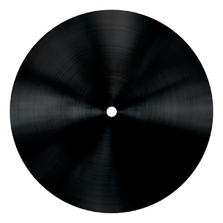
Then I had to make the film reel look more detailed and expensive. I started with the film inside of the reel. I had an idea for this. I knew how to create a vinyl record from a previous tutorial...

I was really happy with the look of vinyl record because it looked like a vintage film strip rolled up from the side view. This was created using a circle and a series of effects and blurs on the circle with shines to bring out the grooves.
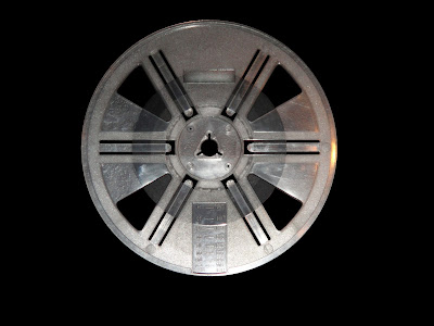
Now I had to produce a more detailed reel. To do this I got my hands on a old vintage film cine-projector and come with a few reels.

This was a photograph of the reel with all of the gaps cut out and put on a black background. This would be used as a base for making my reel. All I needed to do was make it look a more valuable reel. 
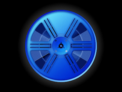
The reel ended up like this. The colour blue was a easy decision because it matched with my company name text and expensive look. It also made the logo look consistent, no other colour looked aesthetically pleasing. This was created using modified selections. The selections would be made and then coloured blue. Gradients would then be added to give the reel definition depending on what selection was modified. Drop shadows would added on each shape to add more definition and to make the reel look more realistic. To help with further definition, the burn and dodge tool was used to lighten and darken areas. A plastic texture was added over the whole thing to make more detail. My film strip roll was added behind the reel and then a slight glow was put behind the whole reel and stronger glow put behind the film to make it stand out. A dark blue circle was added behind the reel and in front of the film strip and then made transparent using opacity to act as glass. To finish the glass, another white shape was added and its opacity was lowered. Finishing touches like screws were then added. My reel was then complete.


The film reel was added to logo poster and positioned off to the left because the viewer will read the poster from left to right. My logo was nearly complete.

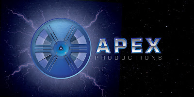
Finishing touches were then added. A bright glow was added using a light blue brush tool with 0% hardness. This made the logo more lively and made the reel look more important and emphasised it is a main part of the logo. I then decided to add lightning to my logo created by a number of lines with glows and gradients. This made my company logo look more powerful and dominant since lightning is quite a destructive and powerful force of nature. A final glow was added to match with the lightning. Then finally, over the top of everything a scratched texture with reduced opacity was added to again create a more powerful look.

I was happy with the final result. Now my logo needed animating. I first did some tester recording involving my old cine-projector...


I wanted to involve a moving projector reel in my animated logo and this test gave me ideas on how I could do this in Adobe After Effects. Since I had my movie company logo poster, all I needed to do was import everything to after effects and animate the shapes accordingly. And I know I wanted a moving projector reel so I came up with this as my animated Apex logo...


This was fiddly to create. The shapes move by rotating, moving and scaling them in conjunction with keyframes. As simple process but difficult to get right as each keyframe needs to be managed. Text appears using opacity and keyframes. A gradual appearance by putting an increase in opacity over a short time. The lightning flashing effect was also using opacity and keyframes. A quick appearance by putting an increase in opacity over frame by frame, a lot quicker appearance which makes a flashing effect. Each layer was imported from photoshop and edited in this way. The finally sounds were added over the top and manually synced to the appropriate time.

My company logos were ready for publishing!