OWN INSTITUTION LOGOS
From my previous research on other post, I knew exactly what institutions and logos I had to create relevant for a trailer.
The first name I come up with was OPTIMUM PRODUCTIONS. I was trying to think of names which had a meaning of 'the best', or 'at the top'. This applied for both my production company, and international company. I come up with a list of words. These are below.
I really liked 'paramount', 'optimum', 'supreme' and 'apex' for company names. From research and general knowledge on film companies I knew what such a company name sounded like. I soon realised there was already a name taken for 'paramount'! So then eventually I chose 'optimum' and 'apex'. Optimum meaning the very best you can get, and Apex meaning at the top, usually described as a top of a mountain. These were perfect company names.
I then decided to use the word 'optimum' as my production company. To not over complicate things and keep things realistic I put the word 'productions' after it. This is is how I developed my first company name.
OPTIMUM PRODUCTIONS
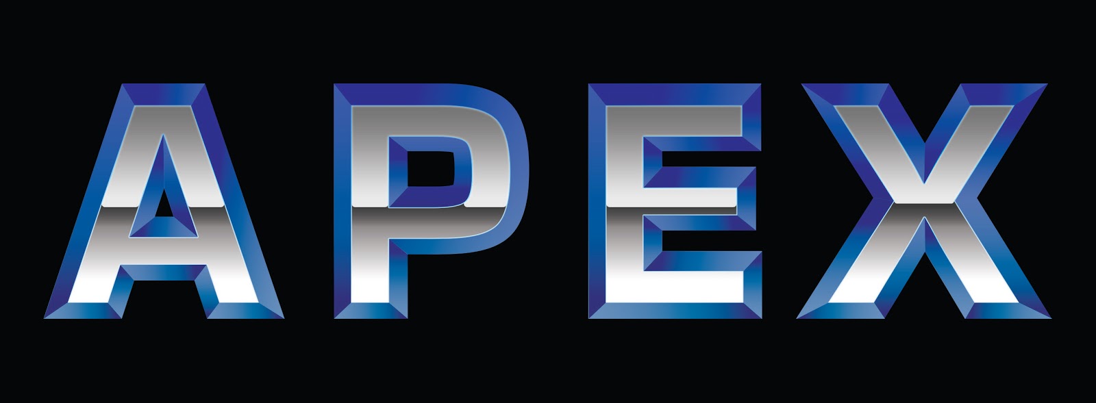
Now that I had my production company. I needed a larger international company which could cater for means of distribution and marketing. I realised I did not need to make a separate company for just distribution as my Apex company would have subsidiaries which could do this. With this in mind, I thought this institution would have a main HQ, a studio where there main building is. Therefore I simply put 'studios' after apex. This would be my international company.
APEX STUDIOS
Now I needed to create logos. My Optimum Productions logo would be quite simple, and not animated because in reality, a small production company would not have a budget to make a fully animated logo to feature on films, although some do, I decided not.
Below is my production company logo...

For this I was thinking of images to do with films. Right away I thought of an actual film strip and imagined a logo. It worked successfully first time and in order to make it look neat, I spread the text out to be the same width as the film strip using very neat and professional 'eurostile' font. This was created on photoshop. Text typed out and the film strip was created using a series of black lines. And selections cut out to create the holes using the selection tools.


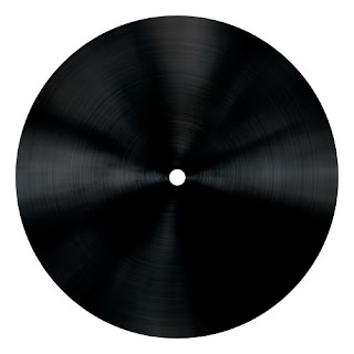 I was really happy with the look of vinyl record because it looked like a vintage film strip rolled up from the side view. This was created using a circle and a series of effects and blurs on the circle with shines to bring out the grooves.
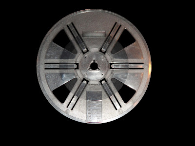 This was a photograph of the reel with all of the gaps cut out and put on a black background. This would be used as a base for making my reel. All I needed to do was make it look a more valuable reel.
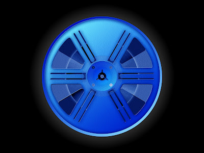 The reel ended up like this. The colour blue was a easy decision because it matched with my company name text and expensive look. It also made the logo look consistent, no other colour looked aesthetically pleasing. This was created using modified selections. The selections would be made and then coloured blue. Gradients would then be added to give the reel definition depending on what selection was modified. Drop shadows would added on each shape to add more definition and to make the reel look more realistic. To help with further definition, the burn and dodge tool was used to lighten and darken areas. A plastic texture was added over the whole thing to make more detail. My film strip roll was added behind the reel and then a slight glow was put behind the whole reel and stronger glow put behind the film to make it stand out. A dark blue circle was added behind the reel and in front of the film strip and then made transparent using opacity to act as glass. To finish the glass, another white shape was added and its opacity was lowered. Finishing touches like screws were then added. My reel was then complete.

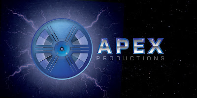 Finishing touches were then added. A bright glow was added using a light blue brush tool with 0% hardness. This made the logo more lively and made the reel look more important and emphasised it is a main part of the logo. I then decided to add lightning to my logo created by a number of lines with glows and gradients. This made my company logo look more powerful and dominant since lightning is quite a destructive and powerful force of nature. A final glow was added to match with the lightning. Then finally, over the top of everything a scratched texture with reduced opacity was added to again create a more powerful look.
APEX STUDIOS
Now I needed to create logos. My Optimum Productions logo would be quite simple, and not animated because in reality, a small production company would not have a budget to make a fully animated logo to feature on films, although some do, I decided not.
Below is my production company logo...


Above is the logo for my movie poster. This would go near the bottom of the poster with the credits where it was coloured with a black background. So as my logo needed to stand out I simply inverted the colours so it would show white, like on a typical film poster.
Below is my Apex Studios logo...

For this I was thinking along the same lines as my logo above this one. Film, and that made think of old film projectors. Then I thought a film reel would make a good base for a company logo.
This logo was worked on as an image first, then I would animate it because my ideas would be solid and I would know where I was going.

This was my simple version of the logo for my poster. Using the same technique of inverting colours.
Below is my logo initially...

Being very simple, this would be a starting point for the development of my logo. A simple reel was created out of circle shapes, and selection shapes to cut out. I decided to work on the actual text first. The whole logo had to look 'expensive' and 'valuable'. Because its title connotes 'at the top', the logo had to be 'the best' as well as the company.
Below is what I come up with for the text...
This was created using text first, then that text rasterised so it could be edited. Then a copy was made and placed underneath the original layer and made bigger. On this layer I used a series of lines and selections to created the emboss effect. These were then coloured in a dark blue to royal blue gradient opposing each other to look like shines and shadows. The main text was then coloured grey and a selection was created and made a dark grey to light grey gradient. This created a reflection look.
The royal blue has connotations of expensive as it is classed as 'royal'. Signifying expense. Grey also has the same connotations because of the precious metal silver. With the shines, reflections and bold text this would give an overall expensive look. Since the text stood out on a black background, I decided to go with it for my main background. This made me think of space. Space occupies black colours and shines from stars. If a logo was based in space it would look magnanimous and this suggests the company making it is rich, fitting into my 'expensive look'. Therefore stars were added to my background and glares were added to the text, created using lens flares and brush glows. Underneath my company name I needed 'studios'. I decided to put productions underneath instead because for this film at its current stage, only production companies are needed. The logos would be featured on my trailer, website, and film poster. Since my trailer was my main product, the film is not released yet, which means it does not need a distribution company yet. New Line Cinema, a company which deals with distribution to only cinemas would be used for the poster. So I have two production companies and a cinema distribution company working with my film. Apex will be in charge of making my trailer.

So far so good...
Then I had to make the film reel look more detailed and expensive. I started with the film inside of the reel. I had an idea for this. I knew how to create a vinyl record from a previous tutorial...
 I was really happy with the look of vinyl record because it looked like a vintage film strip rolled up from the side view. This was created using a circle and a series of effects and blurs on the circle with shines to bring out the grooves.
Now I had to produce a more detailed reel. To do this I got my hands on a old vintage film cine-projector and come with a few reels.
 This was a photograph of the reel with all of the gaps cut out and put on a black background. This would be used as a base for making my reel. All I needed to do was make it look a more valuable reel.
  The reel ended up like this. The colour blue was a easy decision because it matched with my company name text and expensive look. It also made the logo look consistent, no other colour looked aesthetically pleasing. This was created using modified selections. The selections would be made and then coloured blue. Gradients would then be added to give the reel definition depending on what selection was modified. Drop shadows would added on each shape to add more definition and to make the reel look more realistic. To help with further definition, the burn and dodge tool was used to lighten and darken areas. A plastic texture was added over the whole thing to make more detail. My film strip roll was added behind the reel and then a slight glow was put behind the whole reel and stronger glow put behind the film to make it stand out. A dark blue circle was added behind the reel and in front of the film strip and then made transparent using opacity to act as glass. To finish the glass, another white shape was added and its opacity was lowered. Finishing touches like screws were then added. My reel was then complete.
The film reel was added to logo poster and positioned off to the left because the viewer will read the poster from left to right. My logo was nearly complete.
Finishing touches were then added. A bright glow was added using a light blue brush tool with 0% hardness. This made the logo more lively and made the reel look more important and emphasised it is a main part of the logo. I then decided to add lightning to my logo created by a number of lines with glows and gradients. This made my company logo look more powerful and dominant since lightning is quite a destructive and powerful force of nature. A final glow was added to match with the lightning. Then finally, over the top of everything a scratched texture with reduced opacity was added to again create a more powerful look.
I was happy with the final result. Now my logo needed animating. I first did some tester recording involving my old cine-projector...
I wanted to involve a moving projector reel in my animated logo and this test gave me ideas on how I could do this in Adobe After Effects. Since I had my movie company logo poster, all I needed to do was import everything to after effects and animate the shapes accordingly. And I know I wanted a moving projector reel so I came up with this as my animated Apex logo...
This was fiddly to create. The shapes move by rotating, moving and scaling them in conjunction with keyframes. As simple process but difficult to get right as each keyframe needs to be managed. Text appears using opacity and keyframes. A gradual appearance by putting an increase in opacity over a short time. The lightning flashing effect was also using opacity and keyframes. A quick appearance by putting an increase in opacity over frame by frame, a lot quicker appearance which makes a flashing effect. Each layer was imported from photoshop and edited in this way. The finally sounds were added over the top and manually synced to the appropriate time.
My company logos were ready for publishing!
No comments:
Post a Comment